Given forecast data, highlight the specified quantile intervals.
Arguments
- plt
(Optional) A ggplot object. it will be added to using the
+operator. Defaults to NULL, in which case a blank ggplot object will be created.- fcst
A forecast object (see output of
create_forecast()).- quant_intervals
(Optional) A list of pairs of numbers between 0 and 100, or a single pair of such numbers. If not provided, the quantile intervals will be inferred from the forecast. Otherwise, each pair will be used as a quantile intervals.
- alpha
(Optional) The alpha parameter to be passed to
ggplot2- palette
(Optional) The colour palette to use (see
?ggplot2::scale_fill_brewer)
Examples
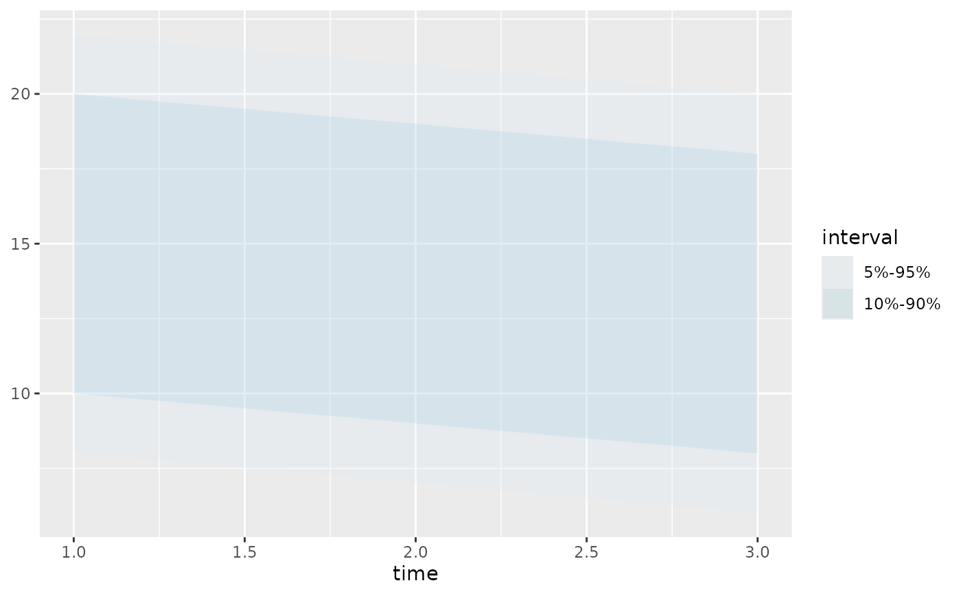
# forecast with quantile data
fc1 <- create_forecast(dplyr::tibble(
time=1:3,
val_q5=8:6, val_q95=22:20,
val_q10=10:8, val_q90=20:18,
val_q25=14:12, val_q75=16:14
))
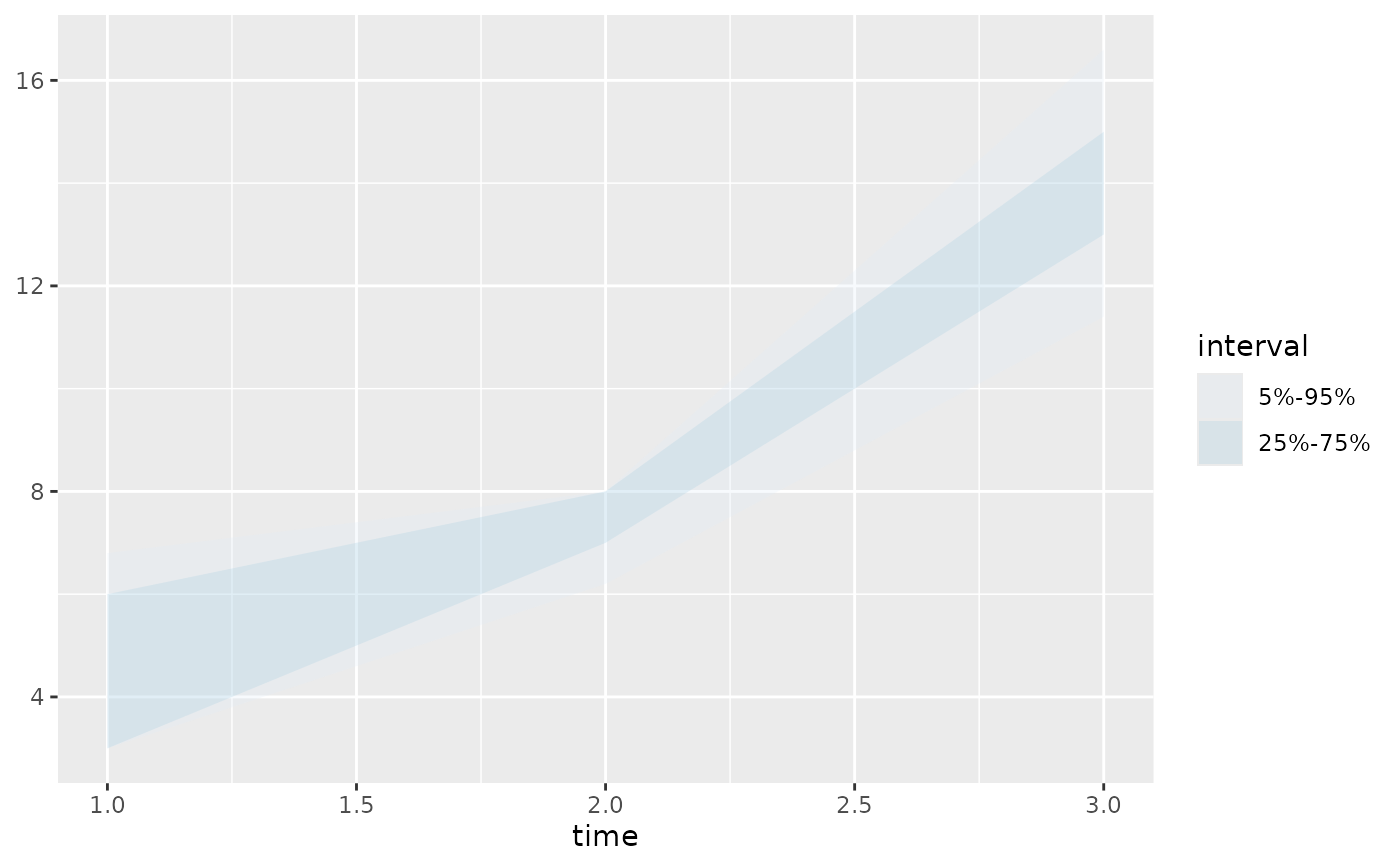
# forecast with raw data
fc2 <- create_forecast(dplyr::tibble(
time=rep(1:3, each=5),
sim=rep(1:5, 3),
val=c(c(3,5,6,7,3), c(6,8,7,8,7), c(11,15,13,14,17))
))
# infer quantile pairs
plot_quant_intervals(NULL, fc1)
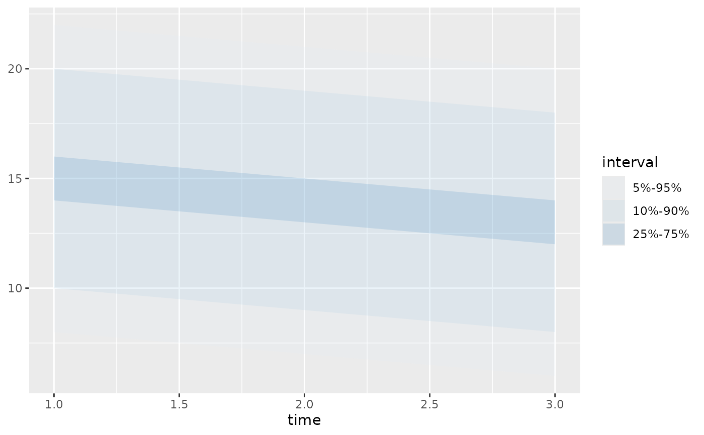 # manually specify quantile pairs
plot_quant_intervals(NULL, fc1, list(c(5,95), c(10,90)))
# manually specify quantile pairs
plot_quant_intervals(NULL, fc1, list(c(5,95), c(10,90)))
 # quantile pairs must be specified for raw data
plot_quant_intervals(NULL, fc2, list(c(5, 95), c(25,75)))
# quantile pairs must be specified for raw data
plot_quant_intervals(NULL, fc2, list(c(5, 95), c(25,75)))