Given forecast data, plot the requested quantiles as lines.
Arguments
- plt
(Optional) A ggplot object. it will be added to using the
+operator. Defaults to NULL, in which case a blank ggplot object will be created.- fcst
A forecast object (see output of
create_forecast()).- quants
(Optional) A vector of numbers between 0 and 100, the quantiles to be graphed. If not provided, the quantile columns in
fcst$datawill be used.- alpha
(Optional) The alpha parameter to be passed to
ggplot2- colour
(Optional) The colour to be passed to
ggplot2
Examples
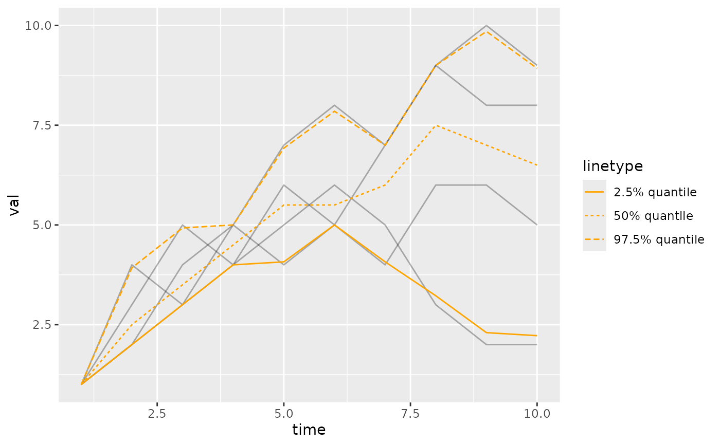
fc <- create_forecast(list(
time=1:10,
vals=list(
c(1,2,3,5,4,5,4,6,6,5),
c(1,3,5,4,6,5,7,9,8,8),
c(1,4,3,4,5,6,5,3,2,2),
c(1,2,4,5,7,8,7,9,10,9)
)
))
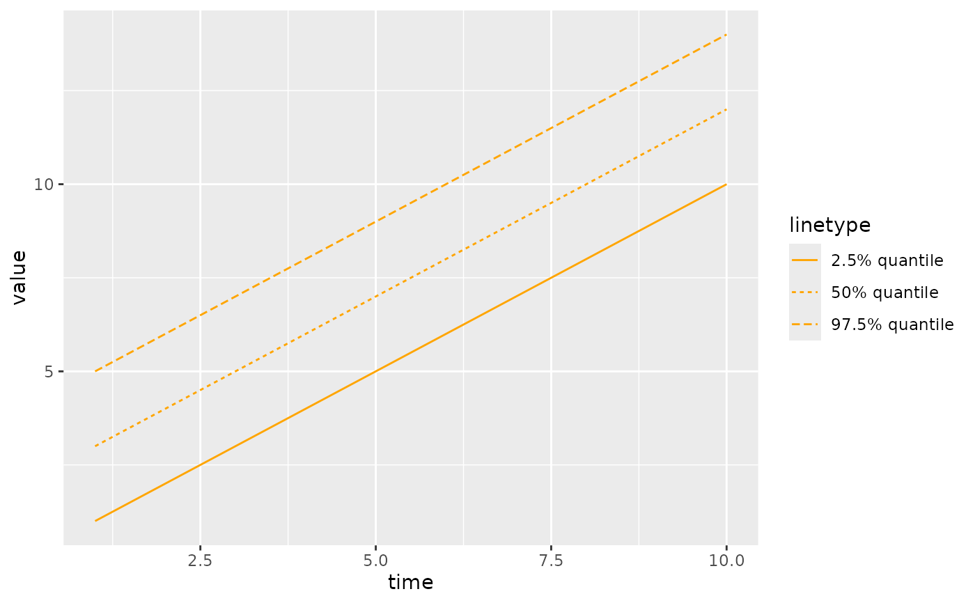
NULL |> plot_ensemble(fc) |> plot_quantiles(fc, quants=c(2.5, 50, 97.5))
 fc2 <- create_forecast(data.frame(
time=1:10,
val_q2.5=1:10,
val_q25=2:11,
val_q50=3:12,
val_q75=4:13,
val_q97.5=5:14
))
NULL |> plot_quantiles(fc2)
fc2 <- create_forecast(data.frame(
time=1:10,
val_q2.5=1:10,
val_q25=2:11,
val_q50=3:12,
val_q75=4:13,
val_q97.5=5:14
))
NULL |> plot_quantiles(fc2)
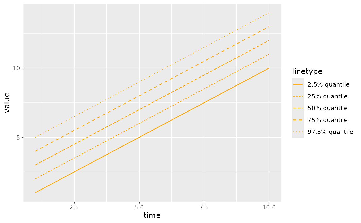 NULL |> plot_quantiles(fc2, quants=c(2.5,50,97.5))